Creatives must appreciate how color communicates
For our creativity moment this month, we are going to focus on color.
As creatives, we are aware of color, and we take notice. A sunset is sweeps of purples and oranges. Autumn leaves are spots of reds and yellows. The sage green of a woman’s eyes. A tint of caramel in a swirl of coffee. As artists we understand, sometimes innately, what colors are complimentary or analogous. We appreciate the warmth of yellow and the coolness of blue.
The aspect of color of which we are often not aware is its impact. Color communicates. In fact, color is one of the most powerful nonverbal forms of communication. Color has symbolic meaning rooted in culture. Or color can invoke physiological responses, increasing or decreasing respiration and heart rate. Color can calm. Color can excite.
And the colors you choose have a powerful emotional impact.
Marketing experts know these facts — and you should, too. It’s not enough you can draw or paint, capture a beautiful landscape or portrait, or pen a poem or story. Awareness of color’s symbolic nature and the impact it has is imperative to effective creation.
Creative Use of Color
You may not have noticed, but in Crouching Tiger Hidden Dragon, the heroine Jen wears only white until she falls in love. Then she wears red. My favorite use of color is that of M. Night Shyamalan in The Sixth Sense. Any object touched by a ghost is red. Go watch it again. How about Star Wars’ red versus blue light sabers? Or the grey palette of The Shawshank Redemption?
One of the most effective use of color was in The Matrix. If the characters are in the matrix, the scene has a green hue. If the characters are in reality, the palette is greyish blue, but natural. The green tint creates a reminder of the dystopian world.
Yet, color can also set a mood. Consider the sweetness communicated in the soft pastels of Pride and Prejudice. Color can also move the story — like the shift from rich colors to greys in The Pianist or the shift from blue to red to yellow and green to represent Arthur’s unravelling in Joker.
Authors use color symbolism to communicate a theme, imbue an object with meaning, or set a mood. A gray day has a distinct feeling from a sunny, yellow day. Hawthorne’s Scarlet Letter would not have been as cruel if it were the Green Letter. Red represents lust. No other color would have been as meaningful. Would Poe’s poem have been as eery if the bird were not a black raven but a white dove? F. Scott Fitzgerald used a green light to communicate Gatsby’s greed and obsession with Daisy. In Catcher in the Rye, Holden describes himself as yellow — cowardly (and, arguably, struggling with his own identity and intellect). Consider the Hogwarts’ houses — each a different color with emotion and psychological associations that pass subconsciously to the reader.
We have the Emerald City and a green-skinned witch in The Wonderful Wizard of Oz. Why not use white? Blue? Green is magical and odd. They don’t follow the Brown Brick Road — the bricks are yellow and full of hope and joy. And those magic red slippers… danger, blood, emergency. A simple note or splash of color communicates so much so easily.
Know Thy Colors
For each color, first become familiar with the psychological, emotional, and cultural meanings. A viewer will see the color and experience the impact subconsciously. Color is a highly effective communication tool. Familiarize yourself with the physical impact color has.
Pink, a warm color, is a tint of red (red with white added). Use pink tosymbolize romance, health (healthy glow), innocence or sweetness, and femininity. An interesting fact: Pink paint has been effective at calming people in police custody. Consider the use of pink in Legally Blonde — where our heroine Elle uses the color as a power statement. Psychologically, pink also communicates weakness or submission, so take care.
Ideas: Use pink to create a potent image or characterization of a powerful person. Craft a story or create an image where pink is the primary color of the scene — but a juxtaposition to something (a person or situation) untoward or malevolent.
Red, one of the primary colors and the second most popular color, creates intense effect. Due to its association with blood and fire, red’s psychological, physiological, and emotional impact is powerful. Consider how strong you want your message when using it. Red can mean glory, lust or passion, courage — or danger. Red is also an effective symbol for anger or violence.
Idea: Use a hint of red in your image or your writing to foreshadow danger. Or insert red into a scene to signal a looming threat or unexpressed passion.
Brown, a combination of blue, red, and yellow, is the color of nature, tradition, stability, and comfort. But brown can also communicate boredom or stagnation, poverty and sickness. Or decay. Be careful when using brown. I would especially note that too much brown in interior design can have an earthy effect — or become too secure where the room is just blah.
Idea: Try using brown to ground your image or scene while using other colors to invoke other emotions or thoughts. For example, notice how a spot of red or a hint of blue alters the message.
Orange, created by mixing red with yellow, is the color of independence and optimism. It’s an active color and will raise the viewer’s pulse and respiration! People who avoid or dislike orange are, at best, risk adverse, and at worst, fearful. As a coach, I’ve found my clients who are frigid or unwilling to exercise hate orange! Interesting. Orange communicates warning or danger or excitement or joy. Consider it the party color.
Idea: Use orange in your art or story to elevate a moment, reveal verbally unexpressed thoughts, or contrast one character with another.
Yellow is, I argue, the most deceitful color. As one of the primary colors, yellow on one hand, represents happiness, creativity, and optimism. But yellow can also represent cowardice, frustration, and egotism. While yellow can help you focus, boost your self-esteem, and stimulate the appetite (and should be avoided in kitchens!), yellow can also cause agitation and depression. Go figure.
Idea: Try to capitalize on yellow’s faceted nature. Use it to express a dichotomy — a character who is a creative coward or a brilliant narcissist. Or, use yellow in visual art to be uplifting and agitating.
Green, a combination of blue and yellow, is nature’s color. Consider health foods and natural products — most use green-based marketing. Going-green is protecting nature! With green, you can invoke balance and relaxation. But green is also the color of envy or jealousy or greed. And we often use green for evil characters, illness or toxic ingredients.
Idea: Use green in your creation to communicate rebirth or health — and then use it to symbolize illness. Consider the compelling use of green in The Matrix (mentioned above) and incorporate it into your work to send a subtle message.
Blue, the most popular color, is the color to communicate trustworthiness or dignity. Blue sky, blue water — power and timelessness. But blue can also communicate sadness or depression. Consider all the shades of blue before you create.
Idea: Create a cool image or story using blue as your primary color. Then, in the same series of images or story, use blue to shift to a sad or isolating feeling.
Purple, a combination of blue and red, enjoys its royal status because of its rarity in nature and the historic expense to create it. Only the rich had purple or violet clothing. So, purple is the go-to to communicate wealth or leadership. And the go-to for power or mystery! Yet purple can also communicate solemnity and grief.
Idea: Use purple in a shocking way by including it in your creation to represent subtle power or magic. For example, I used hints of it to communicate a character’s psychic ability.
Gray is a favorite for me. I find it a powerful means to clear the emotional slate. As a mix of black and white, gray means nothing. It’s neutral and uncommitted. At the same time, gray can indicate wisdom (gray hair, age, experience). If you want to take the viewer’s breath away, don’t use gray!
Idea: Use gray to make a character invisible or understated. Use gray in a story to communicate indifference. Use gray in an image to highlight texture.
Black is caused by the absence of reflected light. This is important to appreciate. Anything that is black has absorbed all the color — like a black hole. Uniformly, black represents power, dignity, and solemnity — but is also associated with aggression, death, and evil. Would Darth Vader have the same impact if he entered that first scene in a green outfit? Or a pink one? Nope. Had to be black.
Idea: Use black in a surprising manner. Dress an innocent child in all black. Photograph a field of spring wildflowers and use editing software to turn the petals black. Appreciate how powerful black is.
White is caused by the reflection of all light — so it is every color. Traditionally, white represents purity and peace. But it can also communicate sterility — in the sense of both cleanliness and inability to create. White can also represent death or emptiness — or surrender. White does not cause a physical reaction — so its effect is strictly cultural.
Idea: If you are a visual artist, notice how white works or doesn’t in your images. When do you use it? Why have you used it? If you are a writer, notice where white appears in your description. Have you used white effectively?
Summary: Mix It Up
As a review, let’s consider color in Todd Phillips’, The Joker. The color pallet, created by cinematographer Lawrence Sher, starts with blue: trustworthy, peaceful. But in the film, blue is the city- the machine of the modern world — that impinges on the main character, Arthur Fleck. We can see how cosmopolitan ideals and the weight of the impersonal, modern lifestyle presses down on him.
Then, the tones shift to red. Normally, the color would indicate danger. And perhaps it does. The director used it to oppose the blue of the city. Happy moments — perhaps when Arthur feels connection, feels alive — contain red. Perhaps the red highlights the peace that escapes Arthur — and therefore the moments that are so few, that escape him and drive him to anger?
When the pallet shifts to yellow, the film patently communicates Arthur’s frustration and loss of identity. And, ultimately, his madness. His confidence — his self — is disappearing. We only see spots of yellow. He is giving up and giving in.
In the end, the tone of the film is green, representing evil and illness. But Arthur, as Joker, adopts a red and orange suit. Danger, action, madness, and anger overcome him. And his persona is directly opposed to the tradition and pretense of the blue city.
The film teaches a valuable artistic lesson. Consider how the use of analogous, complimentary, or other combinations can create psychological dissonance or a sense of cohesion. Consider how altering the color pallet can communicate character development. Also consider the intensity of the color. Hue and saturation can alter the meaning and impact of any color.
And last, consider the absence of color. Photographers often use black and white to highlight texture and shape. You can do the same no matter your medium.
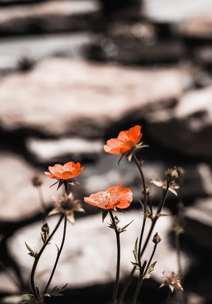
Don’t just paint a sunset sky. Don’t just pen a poem about grief. Don’t just photograph some flowers. Consider the impact the colors will have on your audience.
If you really want to deep dive into color symbolism, check out my book: Color My World. It’s a workbook I use in my workshops — makes for fun, light reading. You can also delve into communication theory to appreciate how color affects meaning.


